In the Winter of 2019, I worked on the Marketing Technology team at Shopify. We were responsible for giving our merchants a platform to tell their unique stories to a wider audience.
My work on the Marketing Technology team focused on product strategy and design; I explored how we could design value-add features for our merchants to grow the marketing channel into a robust revenue stream for Shopify.
Growth was the name of the game and Shopify’s largest growth market was in the APAC (Asia-Pacific) region. This was a region characterized by booming economic growth and an Android-first population. So, we wanted to provide our APAC merchants the best platform to market their products and share their unique stories.
Address the pain points our APAC merchants had with marketing on Android by making it an intuitive and easy marketing experience. To achieve that goal, the visual and interaction design had to be updated to follow the best practices of Google’s Material Design and Shopify’s Polaris design system.
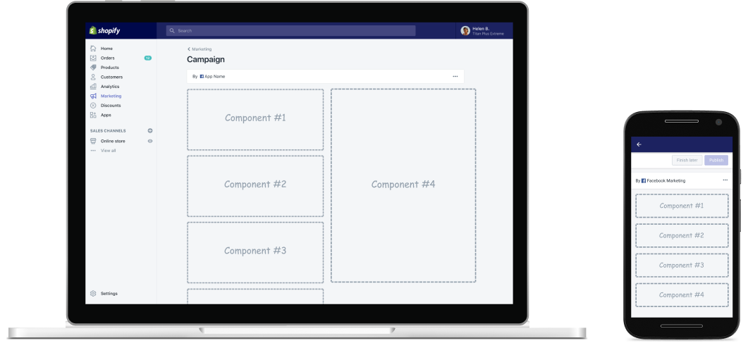
Shopify Marketing’s ecosystem is vast and comprised of both first-party and third-party owned campaigns. All campaigns—regardless of first or third party—are essentially longform pages comprised of components from our Polaris design system.
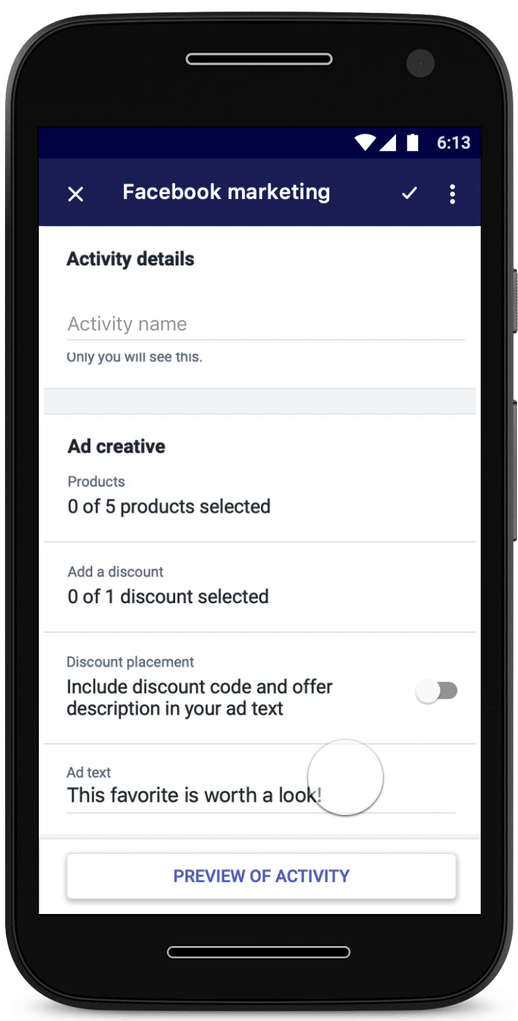
Due to the complexity of the ecosystem, time constraints and the popularity of Facebook in the APAC region, I chose to scope down the project to focus on re-designing Facebook Audience Building Ads.
I began researching longform pages and how others approached translating them into the mobile space without making it a task of indefinite scrolling for the user. I read Airbnb’s philosophy on longform design. Some key takeaways were:

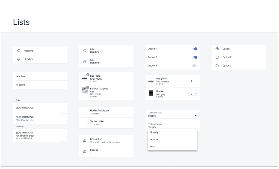
I broke down the design of FB Audience Building Ads into these "basic Lego components." Simple components like text fields already had their mobile native designs in our design system. The more complex components that needed a full rebuild, which were:
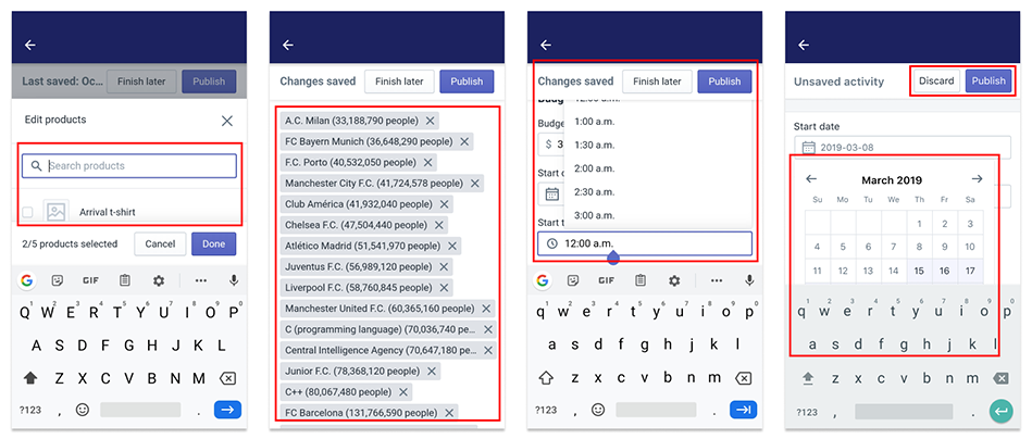
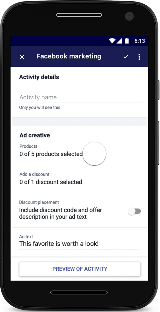
Merchants felt the flow for selecting products, discounts and interests for their FB Audience Building Ad was too inconvenient on mobile; the shrunk down web-view was not optimized for the small screen and it was a major pain point to search and select resources. Furthermore, there was no cap on adding interest tags causing the form to be overwhelming and lengthy.

Drawing inspiration from Airbnb, I decoupled the tasks and resources to create a more seamless flow for selection. By moving the task of selecting and searching of resources to a secondary page, the picker could leverage the full screen height and allow merchants to actually search AND see their resources. Furthermore, the selected resources were shifted to a secondary screen, greatly reducing the length and time to scroll of the main form.
In the previous design, date and time selection utilized dropdown menus. This made it very easy for merchants to mess up their campaign durations on mobile. Since billing was calculated based on campaign duration, the previous design led to higher than unexpected bills for a lot of our merchants (yes, we accidentally created a dark pattern).
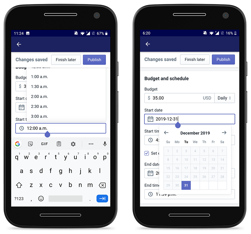
Thus, this was a high priority issue because our mission was to empower not exploit our merchants. I began researching Material’s best practices for date selection and landed on utilizing the system date and time picker.
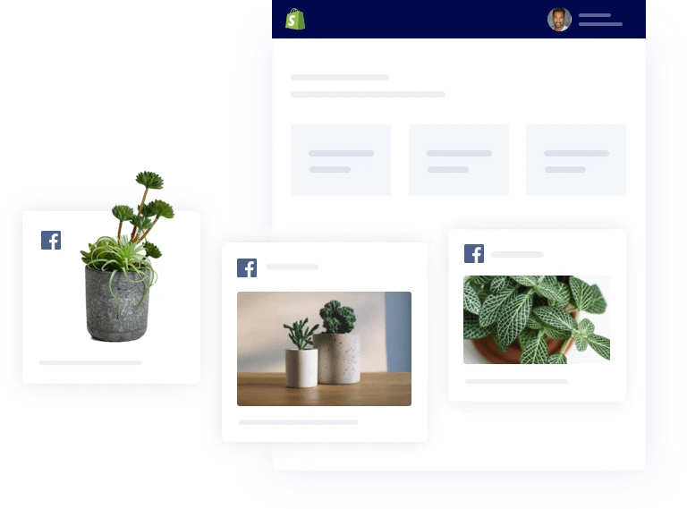
One of the most-used and favourite feature of FB Audience Building Ads was the sticky dynamic preview on desktop. Merchants could see their progress and how filling out the form would affect the look and feel of their ad. However, the mobile design pushed it to the bottom of the form, essentially negating all the strengths (accessible and dynamic) of the feature.
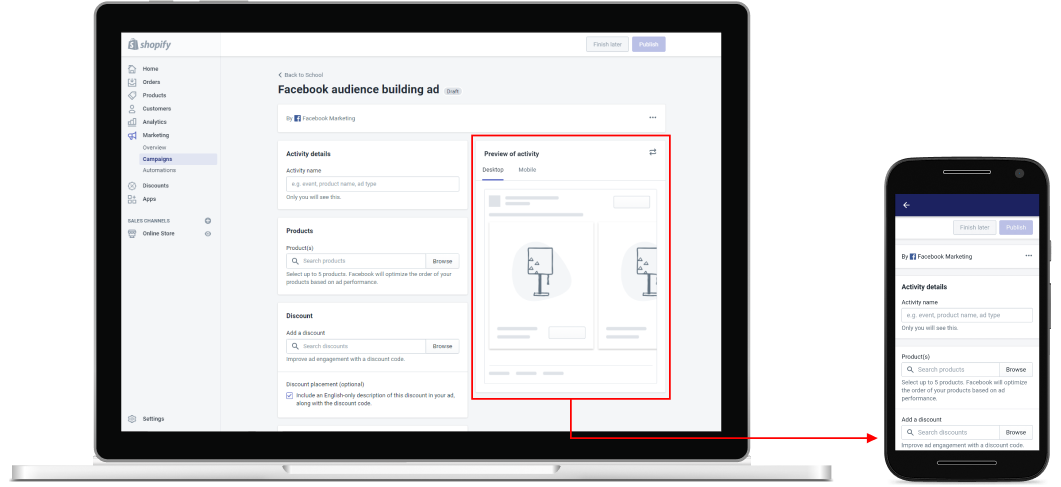
Airbnb’s case study taught me that users need progress visuals, like the preview. So, I designed the preview as a footer button that was always accessible and anchored the user to follow the dynamic preview as the source of truth on how their ad would look and feel.
After exploring various concepts, I had the opportunity to present to our design system committee and was able to ship some of the new components to our design system. Unfortunately, due to new resourcing and investment planning changes, the full project was put on hold.
Although I didn’t get to see my work fully shipped, this was an incredible learning opportunity for me. Some important takeaways for me were: